Google Fonts for Websites: This Is What Professionals Do
Fonts frame the overall appeal of the whole site. For years web designers have been racking their brains trying to find a perfect typeface for each project. With the launch of Google Fonts in 2010 the choice became much easier for professionals and newcomers. All of the fonts provided by Google are free to use and can help increase conversion as well as user-friendliness of the site if appropriately selected. So, let’s see how professionals choose their fonts and how you can do the same.
Why choose Google Fonts for websites?
Table of Contents
All of the fonts are free for commercial use and Google’s library sports a massive selection of 1450 font families. In addition, all of the fonts are updated automatically, once it’s on your website there’s nothing more for you to do but enjoy and produce content. Lastly, Google Fonts also offers multi-language support meaning even if the site is multilingual you’re good to go.
How to choose a font?
- Readability: Readability is priority number one, and not just for aesthetic reasons but also for web accessibility. If you’re producing a lot of long-form content, then it’s usually advised to use a serif font due to its clean appearance and widespread use.
- Popularity: While this may be seen as counter-intuitive at first, choosing an obscure font could hurt your site. Most designers tend to use the same few fonts for nearly all their projects. If it works, it works. You really don’t have to reinvent the wheel.
- Choose a good combination: If you’re planning to use more than one typeface make sure they fit well together. You’d be surprised by how many make this mistake. It’s usually advisable to use a bolder more unique font for headers or titles, and a more subtle popular font for the body.
- Do what feels right: With so many fonts available it can seem a bit overwhelming. But, it’s not rocket science. Browse around the Google library and get a feel for what you like. You may try out a few fonts and end up changing the whole plan. It’s a process.
Best Google Fonts for websites
Sora
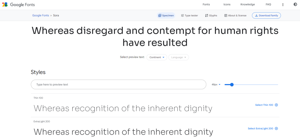
Inspired by the compass, Sora is a classic and easy-to-read font that still allows you to communicate your personality as well as the overall feel of the business. It’s one of the most popular fonts for crypto and tech sites. Plus, the simplicity of the design also ensures legibility in small and larger prints.
Roboto
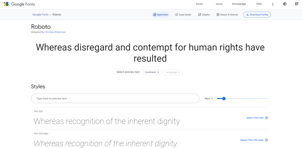
Roboto may seem like the obvious choice as it’s the most popular Google Font of all time. It is highly geometric but also features some nice curves and is incredibly easy to read. Sometimes all you need to complete your site is an evergreen typeface.
That being said if you don’t want to use a classic feel free to opt for something more elegant like Roboto Serif, or more condensed like Roboto Flex.
Open Sans
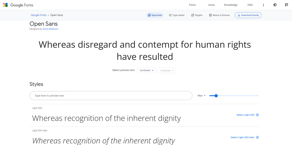
Continuing with the classics. Open Sans is one of the most popular fonts for web design created by Steve Mattheson. It works best for smaller prints or texts featuring a lot of paragraphs. It comes in 13 different styles and is one of the top contenders if what you’re most concerned about is web accessibility.
Raleway
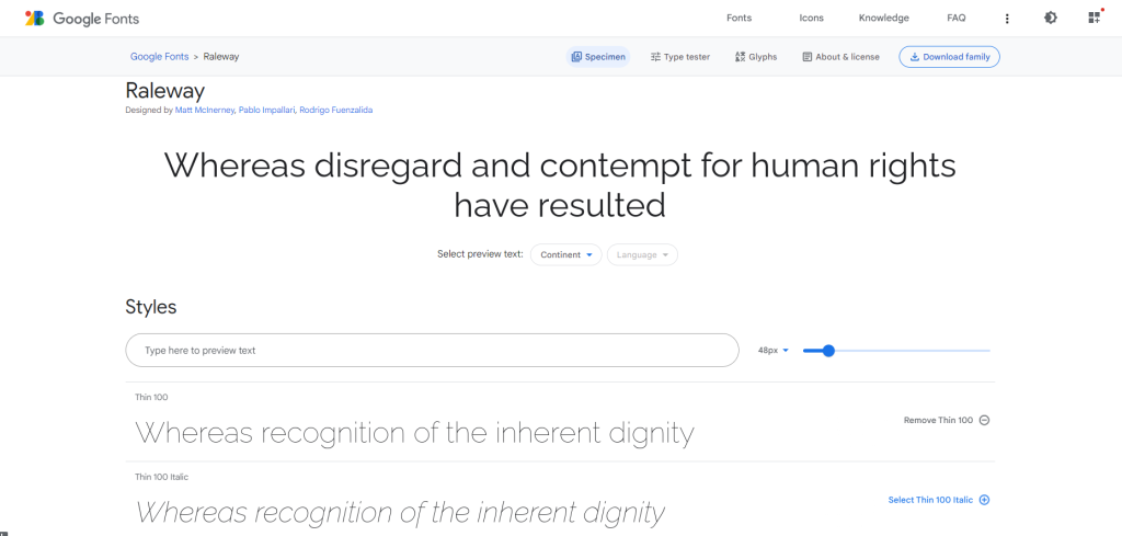
Next on our list is an aesthetic font of the sans-serif family, Raleway. It’s best used for titles and headings due to its heavier weight in larger sizes. One of the reasons so many designers love it is adaptability. No matter if your site is modern or vintage Raleway can complete the picture.
Cormorant
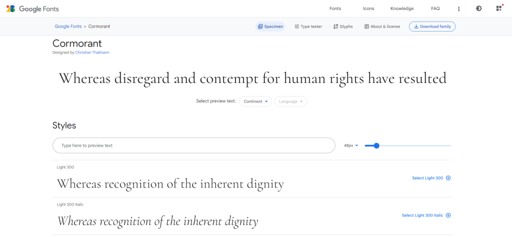
Elegantly hand-drawn and carefully designed Cormorant is the best choice for sites wanting to put up a lavish display. Its delicate curves and towering height add a dash of elegance without proving overbearing. All of this makes it a common choice for designers creating sites with a tad more flare.
Wrapping up
Now you know why you should use Google Fonts for websites as well as how to choose the perfect one. These were just our top choice, but the options are virtually unlimited, so go with the flow and you’ll find the perfect typeface soon enough.

