How to Make Paint Look Metallic in Paint.NET
Want to turn flat color into shiny metal in Paint.NET? You can. And it’s easier than you think. With the right gradients, highlights, shadows, and a few tricks, your design can look like chrome, gold, or brushed steel in minutes.
TLDR: To make paint look metallic in Paint.NET, start with a strong gradient. Add deep shadows and bright highlights for contrast. Use blur and noise carefully to create reflections and texture. Finish with sharpening and blending for a realistic metal shine.
Let’s break it down step by step. Keep it simple. Have fun with it.
Why Metallic Effects Work
Table of Contents
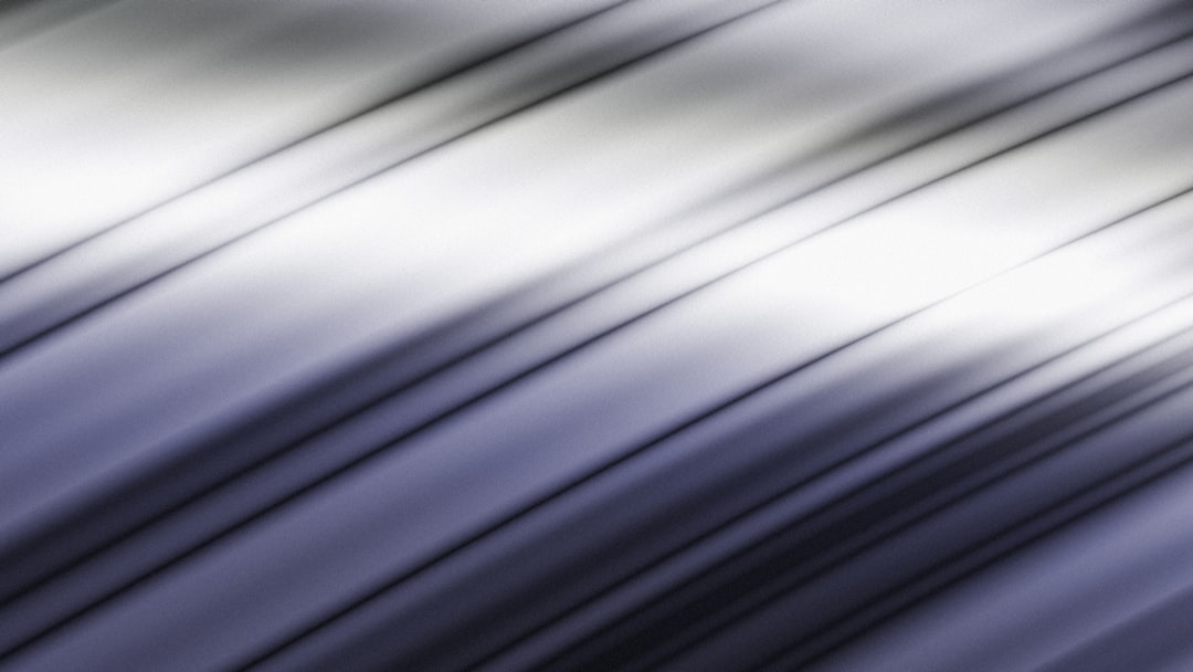
Metal is all about light. It reflects more light than matte surfaces. It has sharp highlights. It has deep shadows. And it often shows smooth transitions between dark and light.
If your design has:
- Strong contrast
- Smooth gradients
- Bright highlights
- Controlled reflections
It will start to look metallic.
Step 1: Set Up Your Canvas
Open Paint.NET.
Create a new image. Choose any size you want.
For practice, try:
- 800 x 600 pixels
- White background
Now create a new layer. Always work on a new layer. It keeps things flexible.
If you’re making metallic text, type your word now using the Text Tool.

Step 2: Apply a Strong Gradient
This is the most important step.
Metal needs contrast. So forget flat colors.
Select the Gradient Tool (G).
Choose:
- Linear gradient
- Foreground to background
Now pick your metallic base colors.
For Silver or Chrome:
- Dark gray
- Light gray
- Almost white
For Gold:
- Deep brown
- Golden yellow
- Pale yellow
Drag the gradient across your shape. Try vertical first. Then horizontal. See what looks better.
The key is this:
Dark → Light → Dark
This pattern gives the illusion of curved metal.
If needed, apply multiple gradients on separate layers. Blend them gently.
Step 3: Increase the Contrast
Now let’s make it shine.
Go to:
Adjustments → Levels
Pull the dark slider slightly inward. Pull the light slider inward too.
This increases contrast.
Metal loves contrast.
If it looks dramatic. Good. That means it’s working.
Step 4: Add Sharp Highlights
This is where magic happens.
Create a new layer.
Select a small, soft paintbrush. Choose white.
Draw thin streaks where light would hit the surface.
Think about curved metal. The brightest part is usually near the center.
After painting the streak:
- Go to Effects → Blur → Gaussian Blur
- Use a small radius
Now lower the layer opacity slightly.
Instant shine.
You can also try changing the highlight layer blend mode to:
- Overlay
- Additive
Both work great for shine.
Step 5: Deepen the Shadows
Metal does not just shine. It also has strong shadow contrast.
Create another new layer.
Use a soft black brush.
Paint gently near the edges.
Blur it slightly.
Lower opacity.
This creates depth.
Now your object looks curved. Not flat.
Step 6: Add Reflection Lines
Real metal reflects surroundings.
You can fake this easily.
Use the Line Tool. Choose white or very light gray.
Create thin horizontal lines across the object.
Now:
- Blur slightly
- Lower opacity
- Erase parts randomly
This gives subtle reflection streaks.
Don’t overdo it. Subtle looks realistic.
Step 7: Create Brushed Metal Texture (Optional)
Want brushed aluminum?
Here’s how.
Create a new layer.
Fill it with gray.
Go to:
Effects → Noise → Add Noise
Use low intensity.
Then apply:
Effects → Blur → Motion Blur
Set angle to 0 degrees for horizontal lines.
Increase distance slightly.
Now set this layer to:
- Overlay
- Or Multiply (experiment)
Reduce opacity.
You now have a brushed metal effect.
Step 8: Make It Look Like Chrome
Chrome is extreme.
It has:
- Almost black darks
- Pure white highlights
- Strong transitions
To achieve this:
- Use a high-contrast black to white gradient.
- Duplicate the layer.
- Apply Curves adjustment to increase brightness range.
- Add intense highlight streaks.
Chrome almost looks unrealistic. That’s fine.
The stronger the contrast, the better.
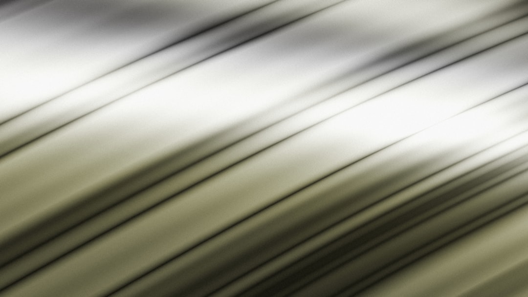
Step 9: Make It Look Like Gold
Gold needs warmth.
Start with brown shadows. Not black.
Use yellow and pale cream highlights.
After gradients:
- Go to Adjustments → Hue/Saturation
- Boost saturation slightly
Add small white glints for sparkle.
Gold shines softer than chrome. Remember that.
Step 10: Add Final Shine Touches
Now refine everything.
Zoom in.
Ask yourself:
- Are highlights bright enough?
- Are shadows deep enough?
- Is the gradient smooth?
If transitions look harsh:
- Use a low-opacity soft brush
- Blend lightly
To boost shine more:
Duplicate the metallic layer. Set it to Overlay. Lower opacity.
This increases glow without repainting.
Bonus Trick: Use Layer Masks for Clean Edges
If you want professional results, keep highlights inside the object only.
Use Magic Wand to select your shape.
Paint highlights within the selection.
This keeps everything sharp and clean.
Common Mistakes to Avoid
Here’s what makes metallic effects fail:
- Using flat color with no contrast
- Too much blur
- No bright white highlights
- Highlights placed randomly
- Not enough dark shadows
Metal needs bold light differences.
If it looks dull, add contrast.
Quick Metallic Recipe
Short on time?
Do this:
- Apply dark to light to dark gradient.
- Increase contrast with Levels.
- Add thin white highlight streak.
- Blur slightly.
- Paint soft edge shadows.
Done.
That alone creates a strong metallic look.
Practice Ideas
Try these projects:
- Metal logo text
- Chrome button
- 3D gold badge
- Brushed steel background
- Futuristic UI panel
The more you experiment, the better your metal will look.
Final Thoughts
Making paint look metallic in Paint.NET is not about fancy tools. It’s about understanding light.
Strong contrast. Smooth transitions. Bright highlights. Deep shadows.
That’s it.
Start simple. Build slowly. Experiment freely.
Soon, your flat designs will shine like polished steel.
And the best part?
You made it yourself.