How to Make an Image Look Distressed in Paint.NET
Distressing an image in Paint.NET is a practical way to give clean artwork a worn, vintage, weathered, or grunge-inspired appearance. Instead of looking newly printed or digitally perfect, the image gains scratches, faded patches, rough edges, paper texture, and uneven color. This technique is often used for posters, logos, album art, T-shirt graphics, social media designs, and retro-style illustrations.
TLDR: To make an image look distressed in Paint.NET, the editor usually combines noise, texture overlays, rough masking, faded colors, and selective erasing. A good workflow starts with duplicating the original image, adding a grunge or paper texture on a new layer, changing the layer blend mode, and adjusting opacity. For a stronger effect, the designer can use noise, blur, curves, levels, and eraser techniques to create scratches, worn edges, and faded areas.
Understanding the Distressed Look
Table of Contents
A distressed image is not simply an image with random dirt added to it. A convincing distressed effect usually has a mix of intentional imperfection and visual balance. The artwork may include cracked ink, faded colors, roughened edges, small missing details, and uneven texture. However, the subject of the image should still remain readable.
In Paint.NET, the distressed style can be created using built-in tools and effects. While additional texture images or plugins can expand the possibilities, a strong result is possible with normal layers, blend modes, noise, adjustments, and basic selection tools. The most important part is working non-destructively, meaning the original image should remain untouched on its own layer.
Preparing the Image in Paint.NET
The editor should begin by opening the image in Paint.NET and immediately duplicating the original layer. This creates a backup and allows experimentation without permanently damaging the source image. In the Layers panel, the original layer can remain at the bottom while edits happen above it.
For best results, the image should have enough contrast. A very flat image may not show distress clearly, while an image with strong shapes, readable text, or bold silhouettes usually responds well. If the artwork contains text or a logo, the designer should make sure the main subject has enough size and weight to survive the texture treatment.
- Open the image: Use File > Open and select the artwork.
- Duplicate the layer: Use Layers > Duplicate Layer.
- Name the duplicate: A useful name might be Distressed Edit.
- Save a working copy: Use the Paint.NET file format to preserve layers.
Adding Noise for a Rough Base
Noise is one of the simplest ways to begin creating distress. It introduces tiny speckles that can later be sharpened, blurred, erased, or blended into the artwork. The editor can select the duplicated layer and go to Effects > Noise > Add Noise. A moderate noise amount is usually better than an extreme setting, because the effect can always be intensified later.
A good starting point is a noise intensity between 20 and 45, depending on the image size. Larger images may need more noise, while smaller graphics often need less. The editor can experiment with color saturation as well. For an old photocopy or screen-printed look, monochrome noise tends to look cleaner and more authentic.
After adding noise, the designer may apply Effects > Photo > Sharpen to make the texture more gritty. If the noise appears too harsh, a slight Gaussian Blur can soften it. The goal is not to cover the whole image with static, but to create an irregular surface that resembles worn ink or aged paper.
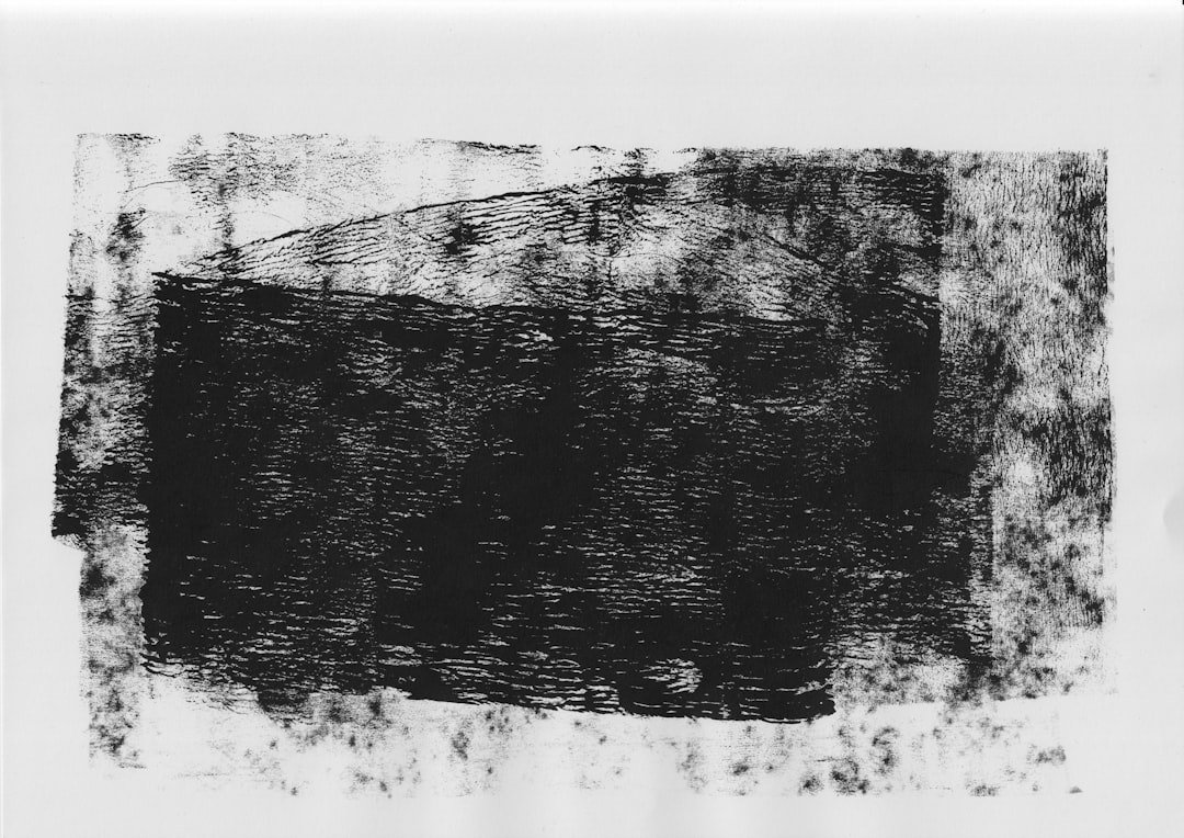
Using a Texture Overlay
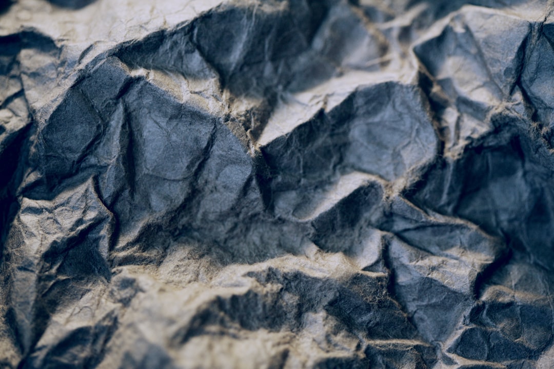
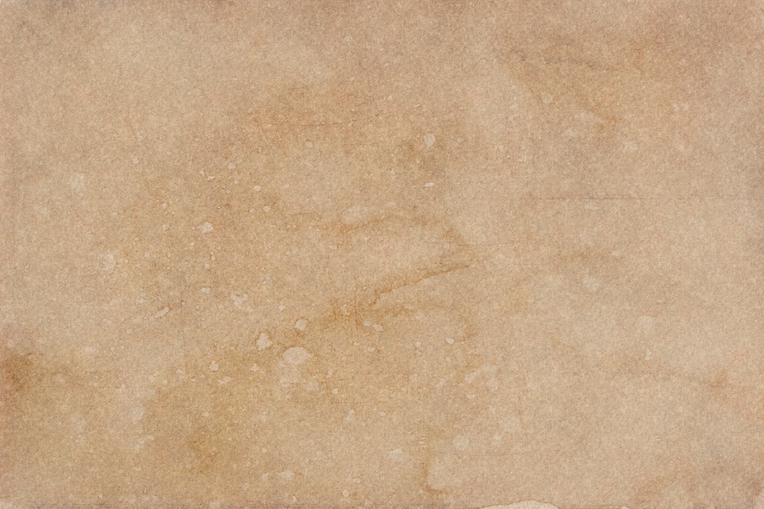
A texture overlay is often the fastest way to create a believable distressed image. The editor can use a photo of scratched paper, concrete, fabric, old cardboard, dust, ink splatter, or cracked paint. The texture should be imported into Paint.NET as a new layer above the image.
Once the texture layer is in place, it should be resized to cover the entire canvas. The editor can then change the layer’s blend mode in the Layer Properties window. Common blend modes for distressing include Multiply, Overlay, Screen, and Color Burn, depending on the texture and the desired look.
- Multiply: Darkens the artwork and works well with black scratches or paper stains.
- Overlay: Adds contrast while preserving much of the original color.
- Screen: Works well for light scratches, dust, or faded highlights.
- Color Burn: Creates a harsher, inkier distressed effect.
The opacity of the texture layer should usually be reduced. A value between 20% and 60% often gives a natural appearance. If the overlay becomes too obvious, the result may look like a texture pasted on top rather than an image that has genuinely aged.
Creating Distressed Edges
Distressed edges help an image look worn by time, friction, or rough printing. In Paint.NET, the editor can create this effect with the eraser, selection tools, or a texture-based mask technique. The simplest method is to select the Eraser tool, choose a soft or irregular brush if available, lower the hardness, and gently remove parts of the outer edges.
If only standard brush shapes are available, the designer can still create rough edges by changing brush size frequently and clicking rather than dragging. Small irregular taps around the border produce a more natural effect than one continuous stroke. The editor should avoid making every edge equally damaged, because real wear is usually uneven.
Another technique involves using the Magic Wand tool on a high-contrast texture layer. The editor can select dark or light areas of the texture, switch to the artwork layer, and press delete. This transfers the texture pattern into the image as missing areas. It is a powerful way to make ink look chipped or cracked.
Fading the Colors
Distressed images often look aged because the colors are muted. Paint.NET offers several adjustment tools for this. The editor can use Adjustments > Hue/Saturation to reduce saturation slightly. A small reduction may be enough for a weathered poster look, while a stronger reduction creates a washed-out vintage style.
The Curves and Levels adjustments can also help. Raising the black point slightly can make dark areas look faded rather than perfectly black. Lowering contrast can create a sun-bleached effect, while increasing contrast can make the image look like old screen printing. The direction depends on the desired mood.
For a retro print effect, the designer may add a warm tint. This can be done by placing a beige, tan, cream, or pale yellow layer above the artwork and setting it to a low opacity with a suitable blend mode. The result resembles aged paper or faded ink.
Adding Scratches and Stains
Scratches, stains, and scuffs make the distress effect more specific. The editor can create scratches manually by drawing thin white or dark lines on a new transparent layer. These marks should vary in length, opacity, and direction. Real scratches are rarely perfectly even, so slight randomness improves the effect.
For stains, the designer can use soft circular brush marks in brown, gray, yellow, or black. These marks should appear on a separate layer so their opacity can be adjusted. A soft blur can make stains look as though they are absorbed into paper rather than sitting sharply on top.
It is usually better to add fewer marks and place them carefully. Too many scratches can distract from the subject. Areas near corners, edges, and open background spaces are often the best places for extra distress, while important faces, logos, and text should remain mostly readable.
Using Layer Masks Through Transparency
Paint.NET does not use layer masks in exactly the same way as some advanced editors, but a similar result can be achieved through selections, transparency, and duplicated layers. The editor can place a black-and-white grunge texture above the image, select areas with the Magic Wand, and delete matching parts from the artwork layer.
This technique is especially useful for distressed text and logos. The texture acts like a stencil that removes tiny pieces of the design. If the deletion is too strong, the editor can undo the step and use a lower tolerance with the Magic Wand. If the effect is too weak, the tolerance can be increased or the process can be repeated with another texture.
Working on a duplicated layer is important here. If the designer removes too much detail, the original layer can still be used to recover the image. The editor can also reduce the opacity of the distressed layer and let the original show faintly underneath, creating a softer worn effect.
Combining Multiple Distress Effects
The best distressed images usually combine several subtle effects rather than relying on one heavy filter. A typical Paint.NET workflow might include a paper texture at low opacity, a noise layer, gently erased edges, desaturated colors, and a few hand-drawn scratches. Each element contributes a small amount to the final aged appearance.
The designer should zoom out frequently to check the overall image. Distress effects that look dramatic at 300% zoom may barely appear at normal size. On the other hand, small details that look attractive up close may turn into visual clutter when the full design is viewed. Checking the image at different zoom levels helps maintain balance.
Exporting the Finished Image
Once the distressed look is complete, the editor should save a layered version first. This allows later changes to texture strength, color treatment, or erased areas. After that, a flattened export can be created for sharing or printing.
For web use, PNG is a strong choice when the image needs crisp edges or transparency. JPEG works well for photographs or textured posters, but too much compression can add unwanted artifacts. For printing, the designer should keep the resolution high and avoid downsizing too early.
Common Mistakes to Avoid
- Overusing texture: Heavy distress can make the image difficult to read.
- Ignoring the subject: Important details should not be completely covered by scratches or missing areas.
- Using only one effect: A single noise filter rarely creates realistic aging by itself.
- Forgetting to duplicate layers: Non-destructive editing makes experimentation much safer.
- Making wear too even: Natural distress is irregular, with some areas more damaged than others.
FAQ
Can Paint.NET make a professional distressed effect?
Yes. Paint.NET can create strong distressed effects with layers, textures, opacity adjustments, noise, and selection tools. The result depends more on technique and texture quality than on expensive software.
What type of texture works best for distressing?
Paper, concrete, scratched metal, dust, fabric, ink splatter, and cracked paint textures all work well. High-contrast black-and-white textures are especially useful for removing parts of an image.
How can text be made to look distressed in Paint.NET?
The editor can place the text on its own layer, add a grunge texture above it, select parts of the texture with the Magic Wand, then delete those areas from the text layer. This creates chipped, worn lettering.
Should the distressed effect be added before or after color adjustments?
Either order can work, but many designers add the main distress texture first and adjust color afterward. This helps all parts of the image feel unified.
How can the distressed effect be made more subtle?
The editor can lower the opacity of texture layers, reduce noise intensity, use softer contrast adjustments, and erase fewer areas. Subtle distress often looks more realistic than an extreme effect.
What file format should be used when saving?
A layered Paint.NET file should be saved for editing, while PNG or JPEG can be exported for final use. PNG is better for crisp graphics and transparency, while JPEG is suitable for textured images and photos.