Logo Contrast Ratios: A Practical WCAG Playbook
Logos are the face of a brand — a professional handshake in the digital world. But when viewed through the lens of accessibility, a beautiful logo may become an obstacle rather than a welcome. As the web increasingly becomes a space for all users, logo contrast ratios have emerged as a hot topic, especially in the context of the Web Content Accessibility Guidelines (WCAG). Whether you’re a designer, developer, or brand manager, understanding how your logo interacts with contrast guidelines is essential.
TL;DR: Logo contrast ratios are not just about aesthetics; they are a key component of making your brand accessible. WCAG guidelines generally do not require logos to meet contrast standards, unless the text within a logo is considered “informative.” However, maintaining readable contrast in logo presentation (especially in interface contexts) can dramatically enhance user experience. This playbook explores practical ways to apply contrast principles to logos without compromising brand identity.
Why Contrast Matters in Accessibility
Table of Contents
Contrast measures the difference in luminance between two colors, typically between the foreground (like text) and background. For users with visual impairments — including color blindness and low vision — high contrast improves readability and reduces eye strain. The WCAG 2.1 recommends minimum contrast ratios of:
- 4.5:1 for regular text
- 3:1 for large text (18pt or 14pt bold)
However, there’s an important nuance when it comes to logos: logos and incidental text are generally exempt from these requirements. That exemption, however, doesn’t mean they should be ignored.
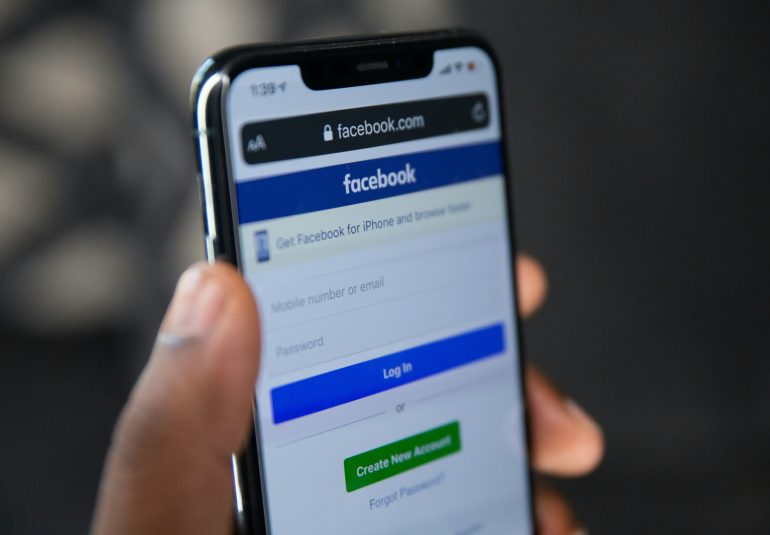
Logos and Contrast: What WCAG Actually Says
According to WCAG, logos fall under the category of “decorative text” or “incidental text”, which are not required to meet contrast criteria. This means your brand name in your logo can appear in white on a light background without technically breaking any rules. That said, if the logo includes taglines, essential product names, or contact information, these elements may be considered informative and thus must follow standard contrast guidelines.
Here’s a quick checklist to determine whether contrast rules apply to your logo:
- Is the text within your logo purely decorative? → No contrast needed
- Does the logo include a tagline with critical information? → Yes, contrast requirement applies
- Is the logo used in a navigation bar or header, potentially as the only identifier? → Consider accessible contrast
Practical Challenges with Logo Contrast
Designers often find themselves wedged between brand guidelines and accessibility requirements. Logos are meticulously crafted pieces of visual identity — and altering their color for better contrast can stir up resistance from stakeholders.
Additionally, logos are often inversed for dark mode, placed on complex or multimedia backgrounds, or overlayed atop gradients. These configurations make contrast consistency especially tricky.
So, how can we navigate these challenges without sacrificing brand consistency or user experience?
A Practical Playbook for Logo Contrast
While WCAG may not require contrast for logo text, implementing contrast-friendly design practices helps make your product more user-friendly. Here’s your playbook:
1. Test Logo Variants Across Backgrounds
Create multiple approved variants of your logo — light, dark, monochrome — to accommodate different background contexts. This ensures you’ll always have a version with good contrast ready for any situation.
2. Use High-Contrast Backdrops Behind Logos
If you can’t change the logo color due to brand restrictions, consider adjusting the background instead. Solid backdrops or semi-transparent overlays can increase contrast without touching the logo itself.
3. Add Drop Shadows or Outlines
Subtle visual techniques such as drop shadows or light strokes can improve a logo’s legibility when color contrast is low. While this won’t entirely meet 4.5:1 ratios, it can improve visibility considerably on noisy backgrounds.
4. Avoid Placing Logos Over Busy Images
When using logos in hero banners or sliders, keep image backgrounds simple or use overlays to prevent interference with the logo’s readability.
5. Conduct Manual and Automated Tests
Use tools like WebAIM’s Contrast Checker or Chrome Developer Tools to measure brightness and contrast. Manual visual testing across devices, especially in sunlight or dim environments, is also important.
Logo Contrast in Practice: Real-World Examples
Let’s look at how major brands handle logo contrast:
- Google: Their full-color logo is updated automatically based on screen context — in UI headers, they frequently use a monochrome white version on dark backgrounds.
- Apple: Uses a minimalist monochrome logo, making it easy to adapt to background changes with strong contrast consistency.
- Coca-Cola: Maintains brand identity with red-on-white or white-on-red designs, ensuring high contrast by default.
These companies understand that while their logos are iconic, contextual adaptability ensures readability and audience reach across all levels of visual perception.
What About Dark Mode?
Dark mode is a significant factor today. If your logo uses dark colors, it may disappear entirely in a dark UI. For accessibility, always consider logo variants tailored for both light and dark modes. Ideally, include the appropriate logo version when switching color schemes based on user preference.
Bonus Tip:
Ask your design team or agency to deliver logo files in SVG format with CSS styling support. This makes it easier to dynamically adjust contrast values and support themes like dark mode more efficiently.
Communicating Across Teams
Logo contrast is not just a design issue — it’s a cross-functional concern. Here’s how to bring everyone onboard:
- Designers: Present high-contrast designs early in the branding phase and provide flexible logo variations
- Developers: Implement dynamic theming and background layering for contrast consistency
- Product Managers: Advocate for accessibility as a business advantage, not just compliance
- Marketing Teams: Educate on the importance of visibility and inclusivity
By embedding accessibility into brand guidelines, you future-proof your visual identity and avoid costly adjustments down the line.
Conclusion: A Logo That Welcomes Everyone
Accessible logo contrast isn’t about diluting your brand. It’s about amplifying it in a way that includes everyone, regardless of how they see the world. WCAG may not flag low contrast on decorative logos, but bad visibility affects real users.
By intentionally designing with contrast-aware strategies, your logo becomes more versatile, future-ready, and above all, inclusive.
Next time you’re applying your logo to a site, a banner, or an email signature — ask not just how it looks, but who can see it.

