Logo Contrast Ratios: A Practical WCAG Playbook
In today’s digital-first world, inclusiveness and accessibility are more than just buzzwords—they’re essential responsibilities for anyone involved in design and development. A key area where accessibility often gets overlooked is branding, especially logos. Since logos are central to brand identity and appear on everything from websites to business cards, ensuring they are accessible to users with visual impairments is crucial. That’s where contrast ratios and the Web Content Accessibility Guidelines (WCAG) come into play.
TL;DR (Too Long; Didn’t Read)
Table of Contents
Logo contrast ratios should meet accessibility standards, especially when logos include text. WCAG doesn’t mandate contrast compliance for purely decorative logos, but when text is present or the logo is integral to understanding the content, meeting minimum contrast ratios is essential. Designers and developers should be aware of contrast requirements, know when they apply, and how to test for them. This article offers a practical approach to aligning your logos with WCAG 2.1 and 2.2 guidelines.
Why Logo Contrast Ratios Matter
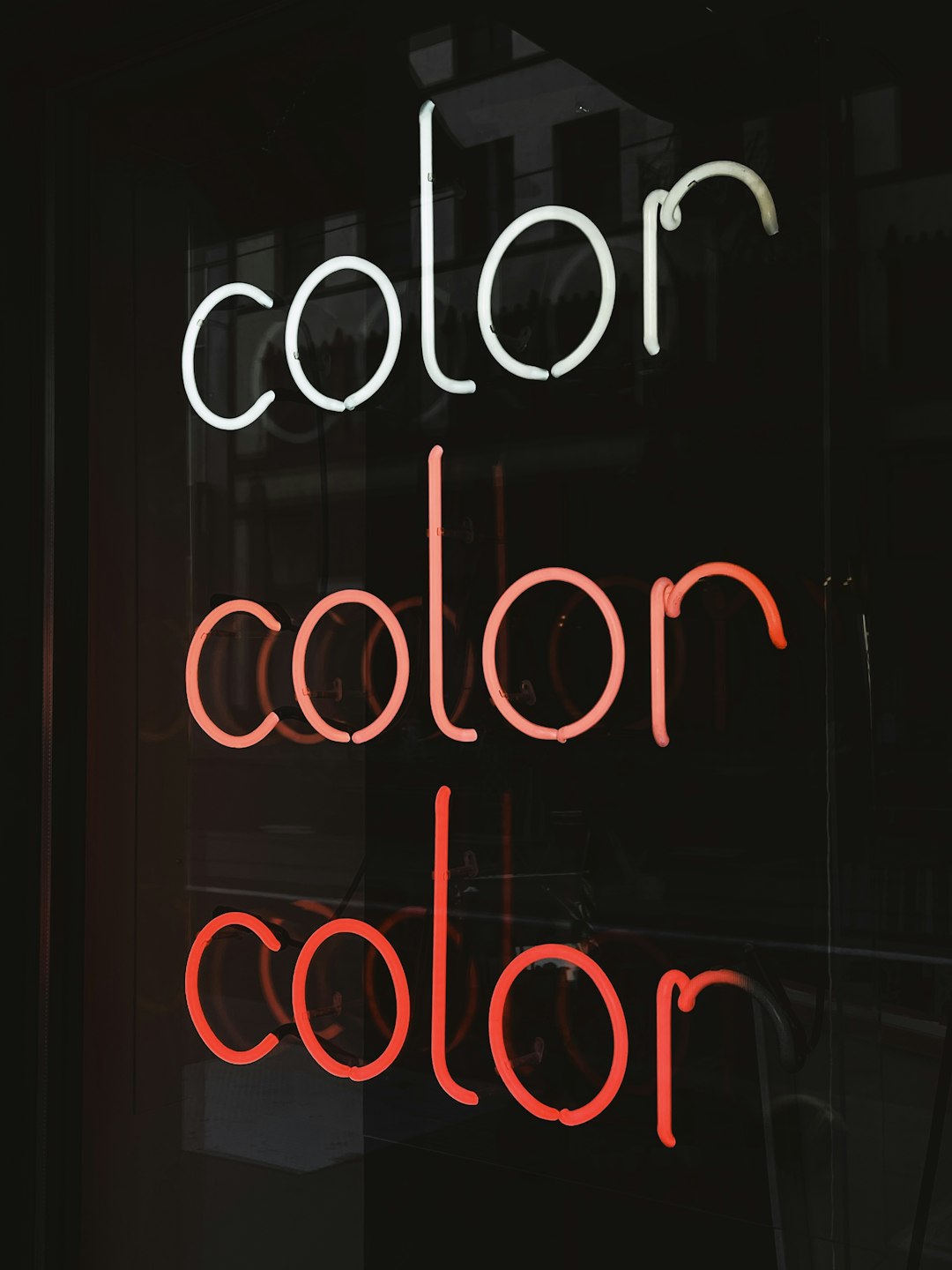
Logos serve as the face of a brand. But when a logo isn’t legible—perhaps due to poor design choices, low contrast, or inappropriate color selection—it not only confuses your audience but can exclude users with visual impairments altogether. According to WCAG, particularly success criterion 1.4.3 (Contrast – Minimum), text in images—including logos—should have a contrast ratio of at least 4.5:1 with its background for normal text and 3:1 for large text (18pt or 14pt bold).
Accessibility means not sacrificing clarity for creativity, especially for users with low vision, color blindness, or other vision-related challenges. By meeting the standard contrast ratios, you’re making sure everyone can identify your brand clearly and easily.
What WCAG Says About Logos
Here’s the nuance: logos themselves, as graphical symbols, are typically exempt from WCAG’s contrast requirements—unless they contain essential text. For example:
- Logo with text (e.g., “Nike” as wordmark): This should meet contrast ratios if it’s expected to be understood as part of the primary content.
- Symbol-only logo (e.g., Apple logo): This is generally considered decorative and not subject to contrast rules.
- Slogan within a logo: If the slogan contains key messaging, it must meet contrast requirements.
According to WCAG 2.1 and its updates in 2.2, it’s all about context. If the logo is conveying essential information and not just decorative flair, then the contrast ratio rules apply.
Common Logo Accessibility Pitfalls
Brands often encounter several issues when creating logos:
- Light text on light backgrounds: White or pastel letters on light backgrounds are illegible to many users with low vision.
- Busy backgrounds: Placing logos over images without contrast overlays can reduce readability.
- Thin fonts or overly stylized typefaces: These may look artistic but often fall short in clarity and contrast.
How to Test Logo Contrast Effectively
If your logo includes text—which is often the case with wordmarks or slogans—you’ll need to test contrast, especially in its intended final form (on your site, in print, etc.). Here are practical steps:
1. Use Trusted Contrast Tools
Just drop in the background and foreground color codes and see if they pass the ratio thresholds—simple as that.
2. Consider Real-World Contexts
Always test how your logo looks across different devices, screen brightness levels, and environments (e.g., outdoors in sunlight). What passes in controlled conditions might fail in the wild.
3. CSS and SVG Overrides
If your site includes vector logos (SVG), consider using conditional styles to increase contrast specifically for display on digital platforms without altering your print assets.
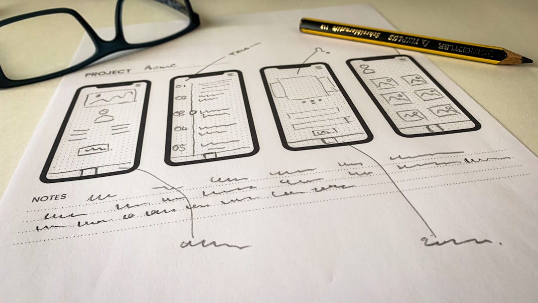
Creating an Accessible Logo: Best Practices
Designing a fresh or revamped logo? Follow these best practices to strike a great balance between brand identity and accessibility:
- High-Contrast Color Pairs: Stick to combinations that naturally offer high contrast—black and white, navy and white, etc.
- Clear Typography: Use legible fonts for any text and avoid ultra-thin or elaborate scripts.
- Dual Versions: Create both light and dark versions of your logo to suit different background needs.
- Minimal Background Clutter: Place text-based logos on solid, clean backgrounds when possible.
- Accessibility Review: Routinely run logo designs through accessibility audits during the design process.
Case Study: A Logo Transformation
Let’s consider a quick hypothetical scenario. Imagine a tech startup named “NovaStream” that used a fancy script font in pale gray over a white background for its logos. Stylish? Sure. But the accessibility was abysmal.
Upon accessibility review, it was discovered that the contrast ratio was about 2.1:1, far below the 4.5:1 minimum. They switched to a darker tone for the text and an easier-to-read sans-serif font. The final color combo achieved a 7.2:1 ratio. Not only did the change boost accessibility—it enhanced brand professionalism and legibility across digital platforms.
Exceptions and Developer Considerations
If you’re a developer working on a project where logos are being embedded dynamically or via third-party services, your control might be limited. In these cases:
- Use alt text to communicate brand if the logo itself isn’t accessible.
- Provide a high-contrast version as fallback.
- Instruct clients on contrast compliance best practices if they provide you with non-compliant logos.
Also, keep in mind that sometimes legal branding guidelines from organizations restrict how a logo can appear. If contrast improvements clash with these rules, consider raising awareness internally about accessibility needs and offer mock designs that balance brand consistency with legibility.
Looking Ahead: What WCAG 2.2 Means for Logos
While WCAG 2.2 updates emphasize enhancements around focus appearance, target sizes, and error prevention, the principles of contrast remain foundational. The trend is clear—accessibility expectations are growing, especially as legal obligations mount under laws like the Americans with Disabilities Act (ADA) and the European Accessibility Act.
That means businesses should get ahead by future-proofing their branding assets, including logos, to comply with accessibility benchmarks early, not reactively.
Conclusion: Design for All
Ultimately, an accessible logo is more than a WCAG box to check—it’s proof of your commitment to inclusive design. As you build or refine your digital presence, prioritize contrast ratios in logo design, especially when text is part of the brand expression. Every user deserves to recognize your brand with clarity and confidence.
By applying the best practices shared here and testing thoroughly, your logo can shine not just in beauty but in usability as well.


