
Best 6 Design Tools for Product Designers Working With Developers
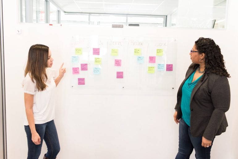
In today’s fast-paced digital landscape, the synergy between product designers and developers is absolutely critical to delivering seamless user experiences. However, this collaboration can also be one of the most challenging aspects of product development. Miscommunication, inconsistent specifications, and mismatched workflows often hinder project outcomes. Selecting the right design tools that cater to both creative and technical needs is essential for building effective, scalable, and polished products.
TLDR
Table of Contents
Choosing the right design tools streamlines collaboration between designers and developers by providing clear specs, executable layouts, and shared design systems. Tools like Figma and Zeplin bridge the gap with excellent developer handoff features, while others like Storybook ensure cohesive UI components. Whether you’re looking for prototyping, documentation, or collaboration, these six tools stand out as the most reliable for joint product design and development workflows.
1. Figma – Real-Time Collaboration Redefined
Figma has emerged as the cornerstone of collaborative design. As a browser-based tool, it eliminates the headaches associated with file versions and sync issues.
- Key features: Multi-user live editing, component libraries, built-in prototyping, and shared design systems.
- Developer benefits: Inspect tool for CSS, iOS, and Android code. Developers get access to dimensions, spacing, colors, and assets without disturbing the design flow.
- Why it matters: Figma removes the friction of hand-off by letting developers see precisely what designers intend.
Designers can quickly prototype flows and share links where developers view the specs in real time. For agile workflows and remote teams, Figma promotes transparency and consistency across every stage of the product lifecycle.

2. Zeplin – From Design to Code, Simplified
Zeplin isn’t a design tool in itself, but it plays a pivotal role in bridging the gap between design and development. Once the design is complete in tools like Figma, Sketch, or Adobe XD, Zeplin provides a structured environment to hand off the work to developers.
- Key features: Design-to-code specs, style guides, color tokens, version history
- Developer benefits: Developers get organized code snippets, downloadable assets, and exact measurements—without having to open the design tool.
- Why it matters: Zeplin enforces consistency by aligning design outputs with developer inputs in a controlled way.
By creating a source of truth around both visuals and their associated code representations, Zeplin ensures the final product mirrors the designer’s original vision with precision.
3. Storybook – UI Development in Isolation
Storybook is a development environment for building UI components in isolation for React, Vue, Angular, and other frameworks. Although it’s favored by front-end developers, designers have increasingly found value in its transparent documentation and visual regression testing.
- Key features: Component isolation, interactive testing, documentation auto-generation
- Developer benefits: Reusable component libraries, consistent UI architecture, visual testing tools
- Designer benefits: Immediate visibility into what components look like, how they behave, and how changes affect the UI
This tool is indispensable when working with design systems, as it showcases how every single UI component behaves in all states. It allows designers and developers to sync without relying on entire app builds to review changes.
Image not found in postmeta4. Zeroheight – Design Systems Made Easy to Share
Zeroheight empowers product teams to create living, user-friendly documentation for design systems. It integrates seamlessly with tools like Figma and Sketch to automate style guide updates as the design system evolves.
- Key features: Documentation generation, component showcasing, editable web-based platform
- Developer benefits: Technical notes and code examples can be embedded directly next to design guidelines
- Designer benefits: Non-technical team members can manage design tokens and principles without coding
For teams prioritizing design consistency, Zeroheight offers a centralized place to store and update UI patterns, color palettes, typography, and other styling guidelines, which are accessible to product stakeholders, designers, and devs alike.
5. Abstract – Version Control for Sketch-Based Workflows
Abstract brings Git-like version control to the design world, specifically for Sketch users. It manages branching, merging, and version tracking so teams can collaborate without overwriting each other’s changes.
- Key features: File history tracking, branch management, centralized feedback
- Developer benefits: Assurance that designs are version-controlled and consistent with implementation requirements
- Designer benefits: Allows safe parallel iterations with a merge and approval process
While more niche due to its Sketch-only limitation, Abstract is immensely useful for enterprise teams and regulated industries where audit trails and team oversight are necessary.
6. UXPin – Prototyping With Real Code Elements
UXPin stands out from conventional prototyping tools by allowing designers to use interactive elements powered by real code. This mirrors the behavior of the final product much more closely than static prototypes.
- Key features: Logic-based interactions, conditional rendering, integrated design systems with live code
- Developer benefits: More realistic prototypes, improved communication of logic across components
- Why it matters: Helps validate designs not just visually but functionally, reducing guesswork in development
UXPin is particularly advantageous for projects with complex user journeys, where screen logic and transitions go beyond what traditional tools like Figma or Adobe XD can simulate.
Image not found in postmetaChoosing the Right Toolset
No single tool does everything perfectly. A robust product design workflow often includes a combination of tools suited to a team’s processes, stack, and stage of development. Here are some example tool combinations depending on workflow needs:
- Fast iteration & tight team integration: Figma + Storybook
- Robust documentation & governance: Zeplin + Zeroheight
- Deep prototyping: UXPin + Figma
- Sketch-based focus: Abstract + Zeplin + Zeroheight
It’s essential to align your tool choices not just with design preferences but also with how your developers work and what integrations your team already uses. Adding new tools should reduce friction, not create more of it.
Final Thoughts
In a world where digital product complexity is increasing, aligning developers and product designers is no longer a “nice-to-have”—it’s mission critical. These six tools don’t just make design more efficient; they make the entire process of building digital products smoother, more predictable, and collaborative. By choosing tools that prioritize clarity, version control, consistency, and interactivity, teams can reduce rework, achieve faster shipping cycles, and improve overall product quality.
Being intentional about your design stack is the first step toward building a team culture where designers and developers speak a common language—one where great ideas go from sketch to shipped without unnecessary complications.