11 Logo Concepts for Breweries, Wineries, and Taprooms
In the world of craft beverages, from artisanal breweries to elegant wineries and rustic taprooms, making a strong first impression is essential. The logo is often the cornerstone of a venue’s brand identity, telling a story long before a customer takes their first sip. With growing competition in the beverage industry, it’s crucial to create a logo that captures the essence of the business and connects emotionally with customers.
TL;DR
Table of Contents
Creating the perfect logo for a brewery, winery, or taproom involves blending personality, tradition, and modern design. These establishments often draw from historical roots, nature-inspired aesthetics, or humor to create memorable visuals. This article outlines 11 standout logo concepts tailored for these beverage businesses. Whether you’re launching a new brand or refreshing your current look, these ideas can serve as your creative springboard.
1. Vintage Rustic
This is a classic look often used by small-town breweries and countryside wineries. Think distressed typography, weathered textures, and icons like barrels or hop vines.
Perfect for: Establishments that wish to highlight tradition, craftsmanship, and regional heritage.
2. Minimalist Monogram
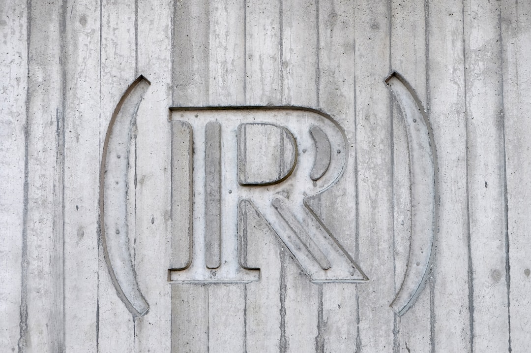
Minimalist logos with typography-based designs, especially monograms, convey sophistication and versatility. Clean lines and simple initials can make a logo adaptable to merchandise, labels, and signage.
Perfect for: Urban taprooms and modern-style wineries looking for a sleek, professional appearance.
3. Nature-Inspired
Many wineries and breweries are rooted in natural surroundings like vineyards, hills, or forests. Logos featuring trees, mountains, rivers, or animals reflect an eco-conscious, serene brand identity.
Perfect for: Brands emphasizing sustainable practices or scenic production landscapes.

4. Art Deco Elegance
Channeling the Roaring Twenties, Art Deco typography and geometric patterns communicate luxury and timeless style. Curved letterforms, gold accents, and symmetry work well on wine labels and signage.
Perfect for: Upscale wine bars or boutique winemakers looking to stand out with a retro flair.
5. Playful Mascots
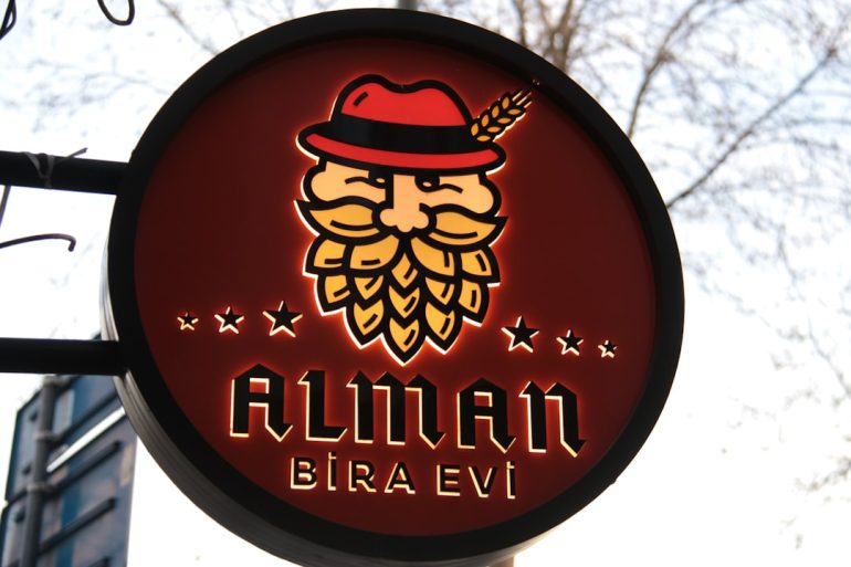
A quirky animal or illustrated character as a central logo element can give a taproom or brewery a welcoming, fun-loving vibe. It also makes the branding more memorable across merchandise, coasters, and digital platforms.
Perfect for: Youthful brands, casual taprooms, or seasonal brewers with a sense of humor.
6. Gothic Heritage
Drawing from medieval and gothic art, these logos use blackletter fonts, coat-of-arms design, and moody color palettes. They nod to European brewing traditions and create a powerful historical resonance.
Perfect for: Traditional breweries, meaderies, or wine cellars with deep-rooted history.
7. Botanical Illustration
Intricate, hand-drawn illustrations of hops, grapes, branches, and flowers can add detail and sophistication. These are often paired with serif fonts to create an artisanal, almost apothecary feel.
Perfect for: Organic winemakers or brewers who elevate craftsmanship and slow production methods.
8. Industrial Bold
Inspired by factory Americana, this style employs bold sans-serif fonts, chunky icons like gears or pipes, and a muted palette. It speaks to the hard-working, local production vibe of many urban taprooms.
Perfect for: Breweries housed in repurposed warehouses or those appealing to blue-collar audiences.
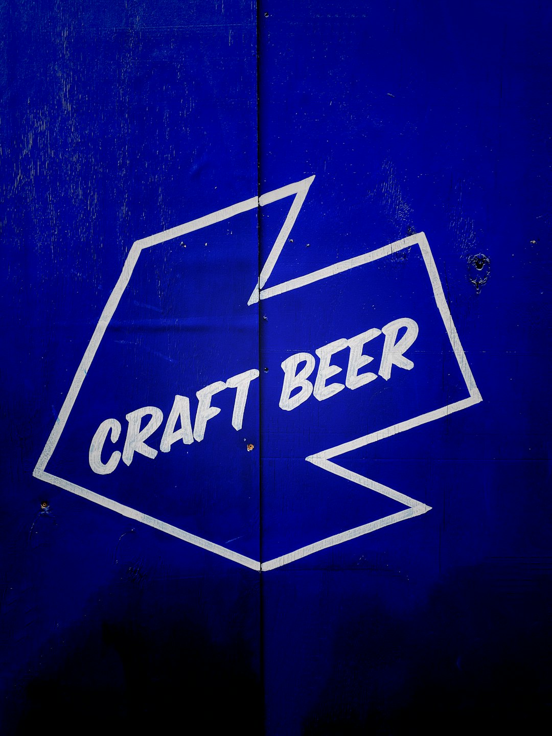
9. Regional Symbols
Many great logos focus on telling a distinctly local story. Whether it’s a skyline silhouette, indigenous plant, or culturally significant symbol, incorporating regional identity can instantly communicate authenticity.
Perfect for: Community-oriented brands trying to create strong local loyalty and pride.
10. Retro Comic Style
Go bold and bright with stylized illustration, retro 50s fonts, and exaggerated humor. This approach is ideal for breweries with eccentric flavors or ironic branding.
Perfect for: Experimental brewers who aren’t afraid to draw attention with a whimsical tone.
11. Heraldic or Crest-Based
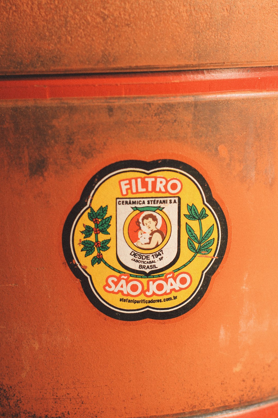
These designs bring an element of authority and legacy, often arranged around shields, banners, or crossed tools (like paddles or corkscrews). They suit high-end, family-owned wineries or brewers with generational stories.
Perfect for: Institutions that want to express longevity, formality, and a legacy of excellence.
How to Choose the Right Concept
There’s no one-size-fits-all logo design. The best concept is one that aligns with the venue’s mission, audience, and aesthetic. If your winery exudes elegance in every tasting room detail, then a minimalist or Art Deco design may fit. But for a noisy, fun neighborhood brewery, a playful mascot could be far more effective.
Consider these criteria when narrowing down your logo direction:
- Brand voice: Is it serious, quirky, traditional, or edgy?
- Demographic: Who are your customers — locals, tourists, collectors, or casual drinkers?
- Format flexibility: Will it scale well on a can, shirt, website, and tap handle?
- Color strategy: Does it look good in both color and grayscale?
- Longevity: Will it still feel relevant in 5–10 years?
Final Thoughts
In the crowded world of craft beverages, your logo is the visual handshake you offer potential patrons. Whether you opt for a rustic script, a forest-inspired motif, or a regal family crest, your logo should echo the values, ambiance, and promise of every glass poured. The 11 logo concepts outlined here can help you brainstorm a direction that not only looks compelling but also drives brand loyalty, storytelling, and connection.
FAQ
- How important is color in a beverage logo?
- Very. Color sets tone and helps with brand recognition. Reds can indicate richness, greens can convey nature or craft, and golds often suggest elegance or aging.
- Do I need different logos for digital and physical branding?
- It’s a good idea to have a primary logo and adaptable versions (like simplified icons or horizontal layouts) for different uses like cans, menus, or social media.
- What file type should I get from my designer?
- Ask for vector files (like .AI or .SVG) so your logo can be scaled without losing quality, and also get PNGs or JPEGs for immediate web and print use.
- Can I make a logo myself?
- Yes, especially with tools like Canva or Adobe Express, but for optimal branding and professionalism, hiring a designer ensures originality and cohesion.
- How often should I rebrand?
- Only when necessary. If your logo no longer aligns with your identity, audience, or mission, it’s time. Minor refreshes can occur every 5–10 years.

