UX Writing: Microcopy That Prevents Tickets
Behind every frustrating support ticket is often a problematic piece of microcopy. Whether it’s an ambiguous button label, a cryptic error message, or a form field that leaves users guessing, poor UX writing can send users down confusing paths—straight into the ticket submission queue. On the other hand, excellent UX writing acts like a silent support agent, helping users help themselves and minimizing the need to ask for clarification.
In the world of user experience design, UX writing plays a crucial role in creating interfaces that are not only intuitive but also self-explanatory. Great microcopy doesn’t just tell users what to do—it reassures, guides, and prevents confusion before it arises. If your goal is to reduce support ticket volume while improving user satisfaction, mastering the art of microcopy is essential.
Understanding the Power of Microcopy
Table of Contents
Microcopy refers to the small bits of text in a user interface—things like button labels, tooltips, error messages, placeholder text, or confirmation messages. These are often overlooked in design, but they have an outsized impact on how users understand and interact with an application or website.
Think about it: if a button simply says “Submit,” the user might wonder: Submit what? What happens after I click it? Can I undo it later? Each unanswered question increases friction and raises the likelihood of user confusion—and eventually, a support ticket.
Good microcopy can eliminate such uncertainties. It works as an invisible guide, offering subtle direction that keeps the user journey smooth and intuitive. It’s not just about being brief—it’s about being clear, helpful, and contextually appropriate.
Why Poor Microcopy Leads to Support Tickets
Support teams often find themselves answering the same basic questions:
- “What does this error mean?”
- “I submitted the form but didn’t get a confirmation—is it working?”
- “How do I reset my password?”
- “Am I being charged if I click this button?”
These are all areas where microcopy could have proactively provided clarity. Tickets like these not only slow down support efficiency, but they also affect customer satisfaction. Users dislike having to contact support for answers they believe should be obvious.
This is particularly pressing in digital products with self-service models—SaaS platforms, e-commerce sites, mobile apps—where users expect seamless experiences and immediate understanding.
Key UX Writing Techniques to Prevent Tickets
If you want to radically reduce unnecessary support tickets, here are some UX writing principles to keep in mind:
1. Be Clear, Not Clever
Witty or branded copy is tempting, but clarity should always take priority. Instead of labeling an action “Blast Off 🚀”, use “Start Campaign” if that’s what the button actually does. Cleverness can be confusing when users are trying to complete a task quickly.
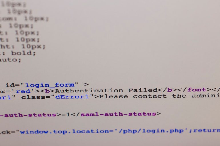
2. Use Error Messages as Teaching Moments
Don’t just say “Something went wrong.” Tell users what went wrong, why, and how to fix it. For instance:
“Your password must include at least one uppercase letter, one number, and one special character.”
This gives users a clear path forward instead of driving them to contact support for guidance.
3. Add In-Line Guidance
Use placeholder text, tooltips, or hover states to guide user input without interrupting their workflow. For example:
- Form field: “Phone Number”
- Helper text: “Please include your country code (e.g., +1 for US)”
This small detail can prevent formatting errors and the inevitable support ticket saying, “Why isn’t my phone number being accepted?”
4. Pre-empt Questions with Anticipatory Design
Put yourself in the user’s shoes and anticipate what they might be wondering at each step. If there’s a delay after clicking “Download,” show a message like:
“Your download will begin shortly. Didn’t start? Click here.”
This prevents the user from wondering if the system is broken and reaching out unnecessarily.
5. Respect the Emotional State of the User
Error messages and unexpected issues can be frustrating. Tone plays a major role here. Instead of saying:
“Invalid input.”
Say:
“Oops! Looks like there’s a typo in your email address. Please double-check and try again.”
This style of communication is helpful, human, and significantly reduces the emotional friction that often fuels support requests.
Examples of Great Microcopy
Let’s dive into a few real-world examples of microcopy that actively prevents tickets:
Example 1: File Upload UI
Bad Microcopy: “Upload”
Improved Microcopy: “Upload PDF or Word Doc (max 2MB)”
Why It Works: It sets file expectations clearly up front. This prevents errors and tickets that ask, “Why won’t my file upload?”
Example 2: Password Reset Page
Bad Microcopy: “Submit”
Improved Microcopy: “Send me a password reset link”
Why It Works: This sets user expectations about what will happen next—with no ambiguity about what “submit” entails.
Example 3: Confirmation Messages
Bad Microcopy: *none*
Improved Microcopy: “Thanks! We’ve received your request and will email you within 24 hours.”
Why It Works: It reassures the user that their action was successful and outlines next steps.

Writing Microcopy That Solves Problems Before They Begin
UX writing isn’t just about filling in blanks. It’s about preemptively solving problems. Here’s a structured approach for writing ticket-preventing microcopy:
- Identify Common Support Issues. Monitor recurring tickets. Are users consistently misunderstanding a key function or getting stuck at a particular point?
- Trace the User Journey. If users are opening a ticket after performing Action X, go back and look at the microcopy associated with that action. Is it clear? Is it misleading?
- Test Your Copy in Context. Run usability testing with real users. Observe whether they hesitate, click the wrong thing, or struggle with input.
- Measure Impact Post-Launch. After making changes, track the volume of support tickets tied to that area. Did they drop? Are users sticking around longer?
This data-driven method ensures that microcopy is not only user-friendly but also strategically effective in cutting down service loads.
A Partnership Between UX Writers and Support Teams
Some of the most successful product teams facilitate regular collaboration between UX writers and customer support staff. After all, support agents know exactly what users are struggling with—and they often solve it with remarkably concise language. That’s a goldmine for UX writers.
Encourage this partnership by asking support teams to flag confusing interfaces or copy, and create a feedback loop where content can be iteratively improved based on real-world friction points.
The ROI of Great Microcopy
Beyond saving time for support teams and reducing user frustration, high-quality UX writing leads to:
- Improved task completion rates
- Lower bounce and abandonment rates
- Higher customer satisfaction and retention
- More scalable onboarding for new users
In the long run, investing in microcopy contributes to a seamless, delightful user experience that supports your brand’s reputation and growth.
Final Thoughts
Microcopy may be small in size, but its impact is enormous. When done right, it anticipates confusion, reassures users, and elegantly guides them toward success without ever needing to click “Contact Support.” It’s one of the most cost-effective, user-focused strategies you can employ.
The next time you’re evaluating your product’s UX, take a close look at the microcopy. It might just be your invisible solution to visible problems.