9 Logo Concepts for Bookstores and Publishing Houses
Logos are like a bookstore’s handshake – the very first impression. Whether you’re starting a cozy indie bookshop or launching your very own publishing brand, a strong logo is a must. But where do you even begin?
TLDR: You want your logo to be eye-catching, memorable, and crafty enough to hint at books, stories, or the magic of reading. This article walks you through nine creative logo ideas tailored for bookstores and publishing companies. From open books to clever fonts, you’ll find concepts that can spark your imagination and get your brand looking photo-ready. Let’s dive in!
1. The Open Book
Table of Contents
This is a classic, and for good reason. An open book instantly tells people what your business is about. It’s simple, flexible, and can adapt to almost any color scheme or design style.
You can go minimalist with just a few lines. Or make it stylish with detailed pages and shadows. Bonus: it can be tilted or shaped to form other images, like wings or a heart.

Great for: Indie bookstores, children’s publishing, or literary nonprofits.
2. Stacked Text
Try stacking the name of your bookstore like a pile of books. Each word or syllable sits on top of the other. The shape can even resemble an actual stack of spines!
The Book Nook becomes:
- The
- Book
- Nook
With each line in a different font or color, this adds personality and charm.
Great for: Hip urban bookstores or YA fiction publishers.
3. The Quill and Ink
Throw it back with a nod to the good ole days of writing. A feathered quill dipping into an inkpot screams classic literature and timeless stories.

Add a parchment-style background and you’ve got a logo that says, “We take writing seriously.” This is perfect for publishers that focus on poetry, classical texts, or historical fiction.
Tip: Use flowing, script-like fonts to match the vintage vibe.
4. Hidden Elements
This one’s all about the ah-ha! moment. Think of logos where the image reveals more the longer you look at it.
Example: Imagine a logo where the negative space between two books forms a candle flame. Or where the letters in your store name also shape a bookshelf.
Great for: Modern publishers or mystery bookshops. It gives off that clever, puzzle-solving energy.
5. Reading Characters
Add a human touch! Draw a person or animal reading a book. It could be a cat curled up with a novel, a curious kid with glasses, or a mystical character lost in a giant tome.
These logos are warm and inviting—perfect for creating that cozy bookstore feel.
Great for: Children’s bookstores, libraries, or family-run shops.
6. Monogram Magic
Initials can be grand if done right. Think bold, clean lines or smart overlapping of letters. A simple “BP” for “Book Place” can become iconic!
You can tuck small symbols into the monogram too. A tiny bookmark, a leaf, or a spark of light between the letters adds detail.
Tip: These logos are very scalable – ideal for stamps, eBooks, websites, or spine printing.
7. Books + Nature
Combine books with natural elements like trees, leaves, or mountains. A book with pages flying off like birds creates movement and beauty. Or imagine a tree whose trunk is made from piled books!
This blend of nature and books tells a story of growth, learning, and imagination.
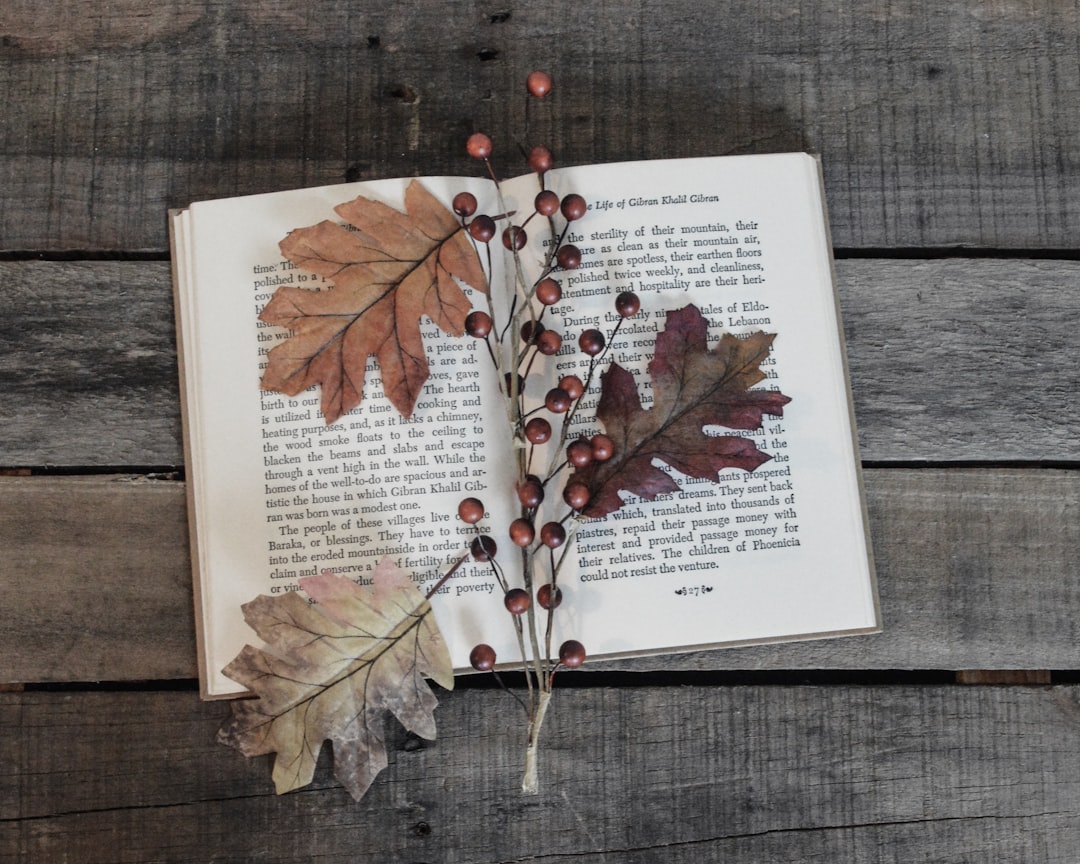
Great for: Eco-themed publishing, poetry collections, or bookstores with outdoor events.
8. Shelf Shapes
Got a love for geometry? Use bookshelf shapes as frames or containers in your logo. Straight lines, right angles, symmetry—it gives off a smart aesthetic and blends knowledge with clean design.
Imagine a square or circle made up of tiny book icons. Or the business name inside a shelf silhouette.
Tip: Keep it modern with sans-serif fonts and neutral colors.
9. Fonts That Tell Stories
Sometimes, the font is the logo. Choose typography that feels like the stories you sell.
- Serif fonts = tradition, elegance
- Handwritten fonts = whimsy, friendliness
- Bold, sans-serif = modern, confident
You can even modify letters to hint at book shapes or pencils. Letter “O” becomes a book, or the letter “T” becomes a candle holder. Small details, big impact.
Great for: All types, depending on your mood and mission!
Final Thoughts
Designing a bookstore or publishing logo should be exciting, not overwhelming. The key is to match your logo style to your brand personality. Are you cozy and friendly? Go with endearing characters or handwritten fonts. More formal? Try monograms or bookshelf layouts.
Play with icons, shapes, and stories. Ask for opinions, and never forget the magic of a well-placed book in art.
So grab your sketchpad, mood board, or latte and start dreaming up your perfect lit-look!

