11 Logo Concepts for Breweries, Wineries, and Taprooms
In a rapidly growing industry where first impressions can make or break a brand, having a unique and eye-catching logo is crucial for any brewery, winery, or taproom. Whether you’re launching a new venture or rebranding an established business, the design on your label or signage sets the tone for your brand’s story. In a saturated market, how can your logo stand out, communicate your values, and connect with your target audience? The answer lies in creative and strategic design choices tailored to your industry and customer base.
TL;DR: Your logo isn’t just an image—it’s the visual handshake that invites customers into your brand world. To help inspire you, we’ve compiled 11 standout logo concepts tailored specifically for breweries, wineries, and taprooms. These ideas focus on style, tone, and storytelling potential. Whether you want classic, edgy, or artisanal, there’s a concept here that might be the perfect match for your vision.
1. Vintage Badge Style
Table of Contents
The badge style logo recalls old-world charm and authenticity. This design often includes ornamental borders, grain or hop motifs, and serif fonts that feel sturdy and timeless. It’s especially effective for breweries and taprooms that offer craft or small-batch products, evoking a sense of tradition and craftsmanship.
Best for: Brands emphasizing heritage, hand-crafted processes, or family-owned values.
2. Minimalist Line Art
With clean lines and plenty of white space, minimalist logos focus on clarity and modern elegance. A simple hop cone, wine bottle outline, or stylized glass sketch can speak volumes. Minimalist logos adapt easily across platforms—from bottle labels to social media—making them incredibly versatile.
Best for: Modern, forward-thinking tasting rooms or urban wineries looking to appeal to younger demographics.
3. Animal Icons
Integrating animals into your logo can add layers of personality and storytelling. From stags and wolves to ravens and goats, the right animal can symbolize strength, mystery, community, or resilience. Combining an animal with brewery or winery elements can help anchor your branding while remaining memorable.
Best for: Taprooms and breweries that want to project charisma, attitude, or playful energy.
4. Typography-Focused Logos
Sometimes the type is the logo. Hand-drawn or customized fonts can express the character of a brand without needing elaborate symbols. Whether you’re using calligraphy for an aged merlot or geometric type for a modern IPA, typography-first logos communicate the core personality of your establishment quickly and efficiently.
Best for: Labels that appear in print, merchandise, and storefronts where name recognition matters most.
5. Barrel and Cask Motifs
Images of barrels, casks, and aging containers evoke thoughts of depth, tradition, and long-standing quality. They are instantly recognizable in the context of alcohol and work particularly well for barrel-aged specialty products.
Best for: Wineries and breweries offering aged, small-batch brews or wines with a complex flavor profile.
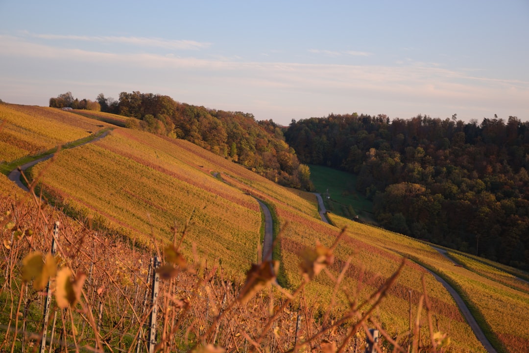
6. Rustic Landscapes
Rustic scenes featuring rolling vineyards, mountainous backdrops, or wooden cabins can connect your brand to a sense of place. These logos often convey peacefulness, sustainability, or local sourcing—appealing to eco-conscious buyers.
Best for: Estate wineries or countryside breweries and taprooms that lean into the farm-to-glass ethos.
7. Coat of Arms or Family Crests
Drawing inspiration from heraldry, logos that look like a shield or crest lend an air of prestige and lineage. These often include initials, grapes, oak leaves, or Latin phrases. They work especially well for wineries looking to position themselves at a higher price point.
Best for: Brands with a historical narrative or who want to convey premium exclusivity.
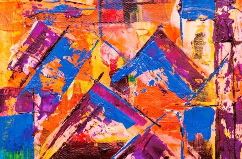
8. Abstract and Geometric Patterns
Using abstract shapes and geometric repetition can result in a logo that feels both modern and artistic. These abstract logos often work best when paired with neutral color palettes and elegant font choices. Their flexibility makes them stand out in digital branding and product packaging alike.
Best for: Contemporary urban wineries or design-forward beer brands that attract creative audiences.
9. Found-Object and Stamp Aesthetic
This approach mimics the look of ink stamps, bottle seals, or even distressed typewriter fonts. It can suggest an underground, indie vibe—perfect for microbreweries or experimental winemakers. The hand-crafted look is evocative of zines, screen printing, and grassroots creativity.
Best for: Edgy, experimental taprooms that embrace creative expression and artisan processes.
10. Botanical and Ingredient-Inspired Designs
Highlighting ingredients like hops, grapes, wheat, lavender, or citrus can immediately communicate what makes your drink unique. These elements can be subtly woven into the background or form the central shape of the logo. Combined with natural color schemes, it’s a feast for both eyes and expectations.
Best for: Brands that emphasize natural processes, organic ingredients, or flavor innovation.
11. Circular Monograms and Seals
Seals and circle-based monograms lend themselves well to bottle caps, coasters, and merchandise. These logos usually combine the business name (or initials) with small design cues like vines, barley, or bubbles to keep things industry-specific. Their symmetry makes them highly versatile for scalability across mediums.
Best for: Breweries and wineries looking for solid all-around branding that translates well in print and digital formats.
The Art of Telling Your Story Through Design
No matter the concept, your logo should be more than decorative—it should function as a storytelling tool. A great logo offers cues into your history, values, and the experience customers can expect. Are you a family-run winery rooted in tradition? A hip new taproom on the cutting edge of craft beer design? Let your artwork tell that tale at first glance.
Design Tips to Guide Your Logo Journey:
- Keep it scalable: Your logo should look just as good on a trucker hat as it does above a doorway.
- Stay consistent: Pick fonts and color palettes that reflect your brand’s mood across all marketing materials.
- Consider your audience: Are they locals, tourists, sommeliers, or college students? Color and aesthetic choices speak to different crowds.
- Hire or consult with professionals: Great logos take time and thoughtful collaboration—don’t hesitate to invest in a solid design partner.
Final Thoughts
Ultimately, a strong logo does more than decorate; it sets the tone and flavor—literally and figuratively—for your entire brand. With the right design concept, you can earn a place not only on someone’s shelf but in their memory. Whether you’re growing grapes or brewing bold IPAs, make sure your visual identity tells the kind of story you’d want to drink to.