11 Logo Concepts for Breweries, Wineries, and Taprooms
Crafting a memorable brand identity is crucial for breweries, wineries, and taprooms looking to stand out in today’s saturated beverage landscape. One of the foundational pillars of that identity is a unique and thoughtful logo. Whether you’re a microbrewery just getting started, a family-owned winery with generations of heritage, or a modern taproom focused on rotating taps, your logo tells your story at a glance.
TL;DR: Your logo is more than just a pretty picture — it’s your first impression. This list breaks down 11 creative logo concepts tailored specifically for breweries, wineries, and taprooms. From vintage illustration styles to clean modern typography, you’ll discover how to make your brand resonate. Each idea is flexible, adaptable, and designed to help visually express your story and set you apart in a competitive market.
1. Heritage Crest
Table of Contents
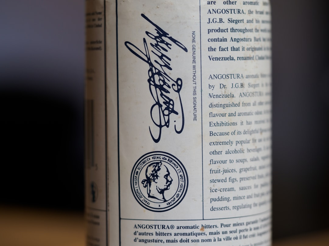
Crests are a natural fit for wineries and traditional breweries looking to portray a story of history, provenance, and sophistication. These logos often resemble family coats-of-arms and incorporate symbols like vines, barrels, animals, and tools of the trade. A crest instantly communicates longevity, craftsmanship, and authenticity.
2. Minimalist Typography
Typography-forward logos are excellent for taprooms and modern microbreweries. Using san-serif fonts, geometric layouts, and clean linework, these logos emphasize clarity and scalability. They’re particularly well-suited for digital media and merchandise — think branded glassware and apparel.
3. Natural Elements
Incorporate natural motifs like grape vines, hop cones, rolling hills, and oak trees to tie your brand to the land. This style works especially well for wineries and farmhouse breweries that want to emphasize terroir, sustainability, or a connection to nature.

4. Retro Americana
Embrace vintage style with retro badges, textured fonts, and color palettes inspired by the 50s and 60s. This aesthetic offers a sense of nostalgia that particularly resonates with craft beer drinkers who appreciate the independent, small-town vibe of many taprooms and breweries.
5. Illustrated Animals
Animal icons have timeless appeal and can offer a unique personality for your brand. Think of a wolf howling into a pint, a raven perched on a cask, or a deer encircled by grape leaves. These logos are friendly, memorable, and lend themselves well to storytelling and naming conventions.
6. Rustic Hand-Drawn Style
This concept relies heavily on hand-drawn illustrations and rough textures, perfect for brands that want to celebrate artisanal craftsmanship. Sketches of equipment like barrels, fermentation tanks, and hand tools work well. A hand-drawn wheat stalk or glass conveys authenticity and handmade quality.

7. Modern Geometric Icons
For a more avant-garde or urban brand approach, consider using abstract geometric shapes and lines to form subtle representations of hops, grapes, or bottles. This modernist approach appeals to certain demographics such as urban millennials and design-savvy customers who value innovation and clean aesthetics.
8. Art Deco Flair
Want something totally luxurious? Art Deco designs borrow from the opulence of the 1920s. Symmetry, gold accents, stylized fonts, and elongated layouts recall an era of speakeasies and elegance. This is a perfect look for boutique wineries or cocktail-inspired taprooms.
9. Monogram Style
A monogram combines the initials of your brand into a stylized emblem. These logos are particularly effective for wineries and breweries with short names or family-built branding. It’s a clean, compact way to create a logo that feels premium and confident while remaining simple.
10. Map-Inspired Logos
Use geography, latitude and longitude coordinates, or topographic elements to ground your brand in place. This type of logo design emphasizes origin and sense of place — making it ideal for regional-only producers or brands that want to emphasize their local roots.
11. Industrial Stamped Logos
Brewtec-focused breweries and some taprooms may gravitate towards an industrial aesthetic. Think of logos that look like they’ve been stamped or embossed onto metal barrels, often with utilitarian fonts and monochrome palettes. These designs evoke durability, machinery, and hard work.

Tips for Customizing Your Logo Concept
Each of the 11 concepts above can serve as a foundation — the trick is to adapt them to your brand’s specific voice and story. Here are a few tips as you develop your own logo:
- Know your audience: Who’s drinking your beer or wine? Are they young hipsters, older wine enthusiasts, or adventurous foodies?
- Prioritize scalability: Your logo should look just as good on a bottle cap as it does on a billboard.
- Balance complexity: While hand-drawn elements are beautiful, too much detail might disappear at small sizes.
- Think beyond the logo: How will your color palette, supporting illustrations, and typography integrate with the symbol?
Final Thoughts
In an industry as competitive and diverse as alcoholic beverages, your logo plays a pivotal role in standing out while instantly conveying your essence. There’s no one-size-fits-all solution, which is why conceptualizing your logo around a specific theme — from rustic and traditional to sleek and modern — can be so helpful in the creative process.
Whether you resonate most with wind-swept grain fields, hop cones etched in steel, or wine-stained parchment textures, there’s a design identity waiting to be uncorked. Choose the concept that aligns with your brand’s story, and you’ll not only attract attention — you’ll keep it.


