11 Logo Concepts for Breweries, Wineries, and Taprooms
In a crowded landscape where microbreweries, independent wineries, and artisan taprooms are gaining popularity, strong branding is no longer optional—it’s essential. Your logo is the cornerstone of your brand identity. It communicates not just the quality of your beverages, but the culture, tradition, and personality behind them. Creating a logo that resonates requires thought, creativity, and strategy.
TLDR (Too Long, Didn’t Read):
Table of Contents
Creating a compelling logo for breweries, wineries, or taprooms is a critical branding decision. The best logos not only reflect the personality of your establishment but also connect with your audience on an emotional level. This guide explores 11 smart and effective logo concepts that can give your business a professional edge. Each idea is crafted to be adaptable, memorable, and grounded in brand storytelling.
1. Heritage-Inspired Crests
Drawing from old-world traditions, crest-style logos evoke authenticity and time-honored craftsmanship. These logos often include intricate linework, monogram initials, and decorative elements like vines, barrels, or hops. This concept suits wineries or historic breweries that want to emphasize longevity and artisan quality.
2. Minimalist Icons
For modern establishments that favor clean aesthetics, a minimalist logo speaks volumes with simple shapes and restrained use of color. Think of a single grape silhouette, a stylized hop cone, or a geometric wine glass. These logos are versatile across digital and print platforms, and their simplicity makes them instantly recognizable.
3. Vintage Typography
Typography-centered logos can be incredibly effective when designed with intention. Using retro serif fonts or hand-lettered scripts, this concept works well for taprooms and breweries aiming for a vintage or rustic charm. Subtle textures like grain or paper noise add tactile character, ensuring that words do more than just inform—they inspire emotion.
4. Animal Motifs
Animals have long served as powerful symbols. Whether it’s a roaring bear, an owl, a raven, or even a fox, incorporating an animal can give your brand a personality and backstory. Choose animals that reflect your values—strength, elegance, wit—to deepen consumer connection. The trick is to stylize the animal into a simplified, repeatable form.
5. Illustrated Landscapes
Wineries and countryside breweries benefit greatly from logos that showcase the environment in which they were born. Hand-drawn hills, vineyards, or hops fields communicate not only the origin of your ingredients but also the soul of your business. These detailed logos exhibit artisanal care and bind your brand closely to nature.
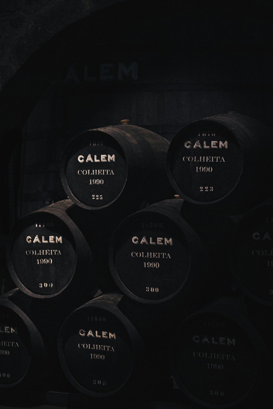
6. Barrel and Bottle Imagery
Incorporating classic beverage-production elements like oak barrels, wine bottles, or pint glasses makes your business instantly identifiable. These objects become symbols of craft and tradition. When integrated thoughtfully, they add purpose and clarity to your visual identity without feeling generic.
7. Badge and Emblem Design
This logo design style is gaining traction, particularly among taprooms and community-centered breweries. Circular or shield-like shapes with symmetrical layouts give off a structured, professional feel. They’re easily adaptable to merchandise like bottle caps, coasters, and signage, making your branding consistent across formats.
8. Monoline Art
Monoline logos use a single line weight to craft beautifully intricate yet coherent designs. From hops and barley to vineyard spirals, monoline offers a trendy yet timeless take on illustration. This style is flexible, often translating well to illuminated signs, wax seals, and engraved growlers.
9. Botanical Line Drawings
Especially fitting for organic wineries or farm-to-glass taprooms, botanical line logos highlight nature’s role in craft beverages. Drawings of grapevines, wheat stalks, or orchard trees emphasize sustainability and earth-conscious philosophies. They lend a handmade, authentic feel that resonates with eco-aware audiences.
10. Abstract Forms
Going beyond literal representation, abstract logos use curves, geometric shapes, and unique combinations to form a logo that feels both modern and intriguing. These are for brands that want to stand out and hint at their creative processes, without overt references to beer or wine. When executed properly, abstract logos offer a long runway for brand evolution.
11. Regional Influences
Every region has its unique symbols, from mountains and rivers to local flora and cultural emblems. Tapping into this native iconography adds depth and identity. Whether you’re operating in Napa Valley or Brooklyn, incorporating a hint of your locale helps build loyalty among locals and intrigue among travelers.
How to Choose the Right Logo Concept
These ideas are starting points. The key to success is aligning the visual identity with your story, ambience, and target audience. When selecting a concept, ask yourself the following:
- What emotions should my brand evoke? Adventure, relaxation, sophistication?
- What story do I want to tell? Tradition, innovation, locality?
- Where will this logo appear? On bottles, signage, social media?
Work with a skilled designer who can translate your business ethos into a visual form. Iterative sketching and real-world mockups (on bottles, glasses, signage) are valuable in refining the final concept.
Final Thoughts
Logos are more than just visual indicators—they’re emotional triggers. A successful logo for your brewery, winery, or taproom establishes trust, piques interest, and becomes a memorable symbol of your craft. By exploring diverse visual routes—from minimalism to botanical art—you gain the creative leverage to stand out in a saturated market while preserving authenticity. Remember, the best logos are not only seen—they’re felt.